Scope
What is the Scope?
The Scope is a graphical tool used to plot parameters from the drive’s dictionary, and visualize their evolution over time in relation to other data. This widget offers many configurable options, including sampling methods, frequencies, and plotting representations. It is also one of the three core widgets that define a workspace.
This tool can be accessed at all times by clicking on the 
Configuring and working with the Scope
How to enable the scope and plot/record data
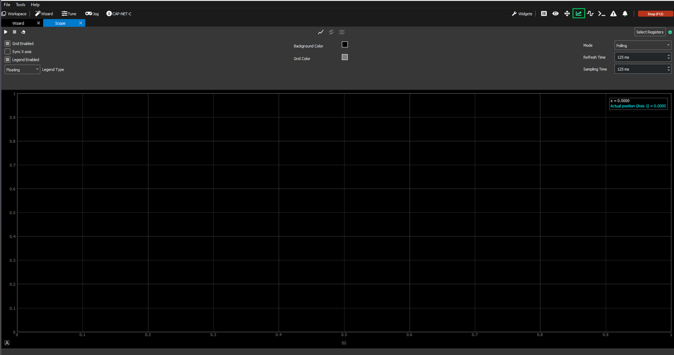
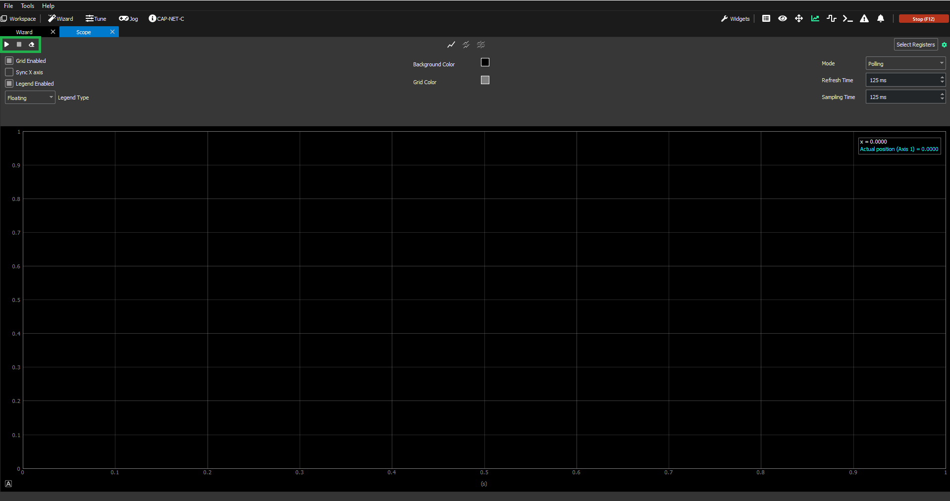
First of all, it is important to mention how the Scope is enabled and how/when the data can start to be represented. This is done using the three buttons in the top-left of the Scope screen (green box below):
Triangle/"Play" button → to start plotting the data selected for that specific chart(s) over time.
Square/"Stop" button → to stop plotting the data selected for that specific chart. The plotted graph will remain visible in the Scope.
Erase button → to stop plotting and erase the content of the Scope so that the graph is empty again.
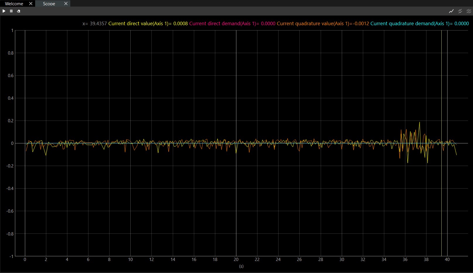
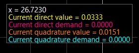
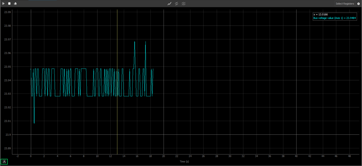
In addition to those buttons, it is important to mention that the Scope also includes a legend. This legend shows the values of the plotted data at the specific time instant where the cursor is placed:
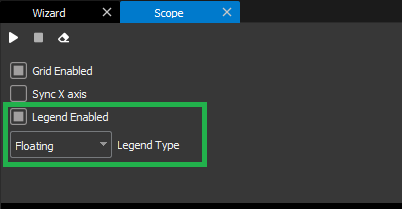
The legend view can be toggled between three modes:
Static: This type of legend sticks to the top side of the graph.

Floating: This legend can be dragged around the graph. It shows all the signal’s information.
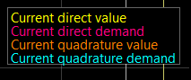
Floating simple: Works like the Floating mode, but it only shows the signals names and colors.
These modes can be switched through the Scope configuration menu:
This applies to a ALL charts present in the Scope.
Configure Scope
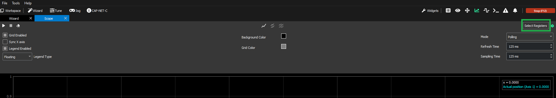
The Scope configuration menu can be toggled with the scope ![]() button in the upper-right corner of the Scope (green box below).
button in the upper-right corner of the Scope (green box below).
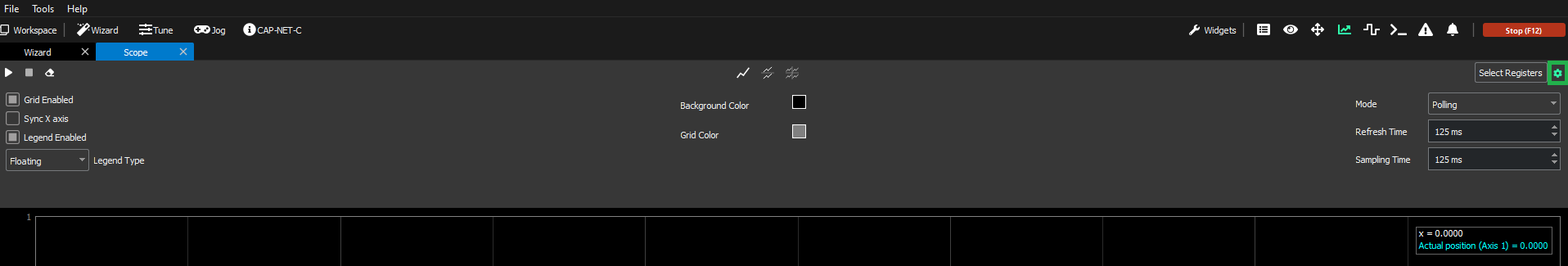
The configuration menu has the following options:
Left and center side
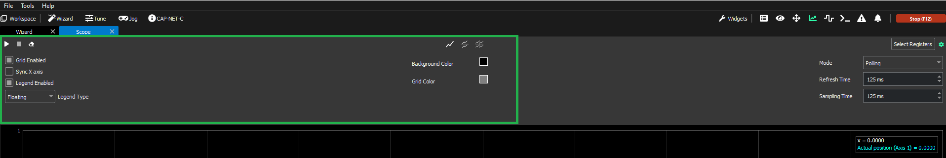
This area has the graphical options:
Grid Enabled → Shows and hides the grid in the graph.
Sync X axis → If enabled, when dealing with multiple charts (2, 4), the X axis synchronizes and when the user drags to move the graph, all the X axes follow the movement.
Legend Enabled → Shows and hides the legend no matter what type is selected.
Legend type → Changes the legend type (Static, Floating, Floating Simple)(see section above).
Background color → Changes the background color of the graph.
Grid color → Changes the color of the grid.
Display Triggers (Only visible in monitoring mode): Shows the trigger, if configured.
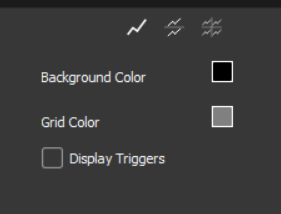
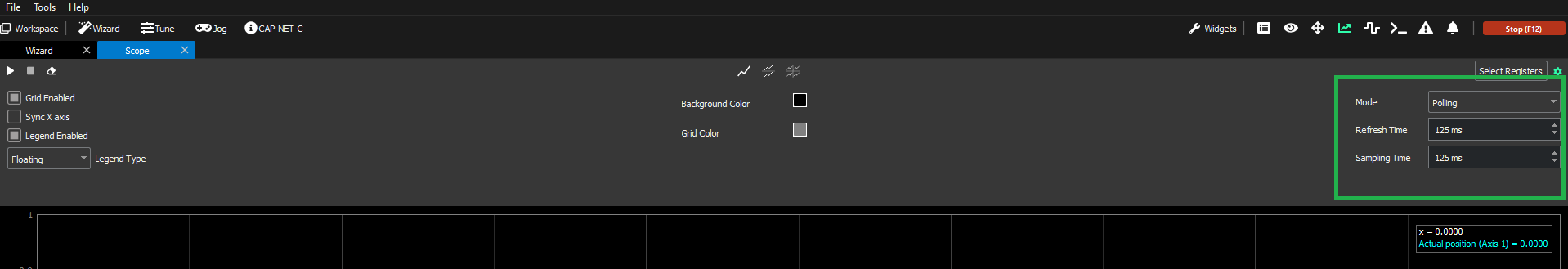
Right side
Polling and PDO Polling
Monitoring
This area has the specific configurations for each scope mode (Polling, PDO Polling and Monitoring), it changes when a different mode is selected:
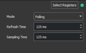
Polling
This is the default mode when opening a scope. It allows the user to see in real-time the data from the selected registers, plotted in a graph. This mode contains two configurable parameters:
Refresh Time: This time influences the speed at which the graph updates.
Sampling Time: It is defined as the time in between sample readings.
PDO Polling
The PDO Polling mode is implemented for Capitan, Everest-S, and Denali. It operates exclusively over EtherCAT communication protocols and requires firmware version 2.5.0 or higher.
While similar to a regular Polling, PDO Polling interacts only with TPDO-mappable registers. It can operate at a faster rate, with the minimum cycle time set at 15 milliseconds, which is smaller than that of a regular Polling. As regular Polling, PDO Polling has two configurable parameters:
Refresh Time: This time influences the speed at which the graph updates.
Sampling Time: It is defined as the time in between sample readings.
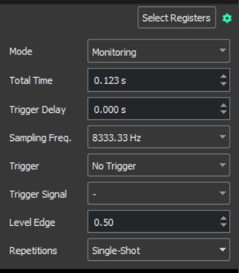
Monitoring
Monitoring mode is used when the user wants to view data from a specific time window. It allows the user to define a buffer, which once full of samples, is displayed on the scope graph. The mode contains different configurable parameters that can be adjusted depending on the user preferences:
Total Time: Total time of data that will be plotted.
Trigger Delay: Delay between trigger raises and the sample window.
Sampling Freq.: Frequency at which the samples are read.
Trigger: Type of trigger which will determine when the monitoring starts.
No trigger
Rising Edge
Falling Edge
Trigger Signal: Register used as trigger signal.
Level Edge: Threshold that initiates monitoring, based on the selected trigger.
Repetitions:
Auto
Single-shot
Select Scope Registers
To change the Scope signals, click the “Select Registers” button. A pop-up with all the available registers will appear:
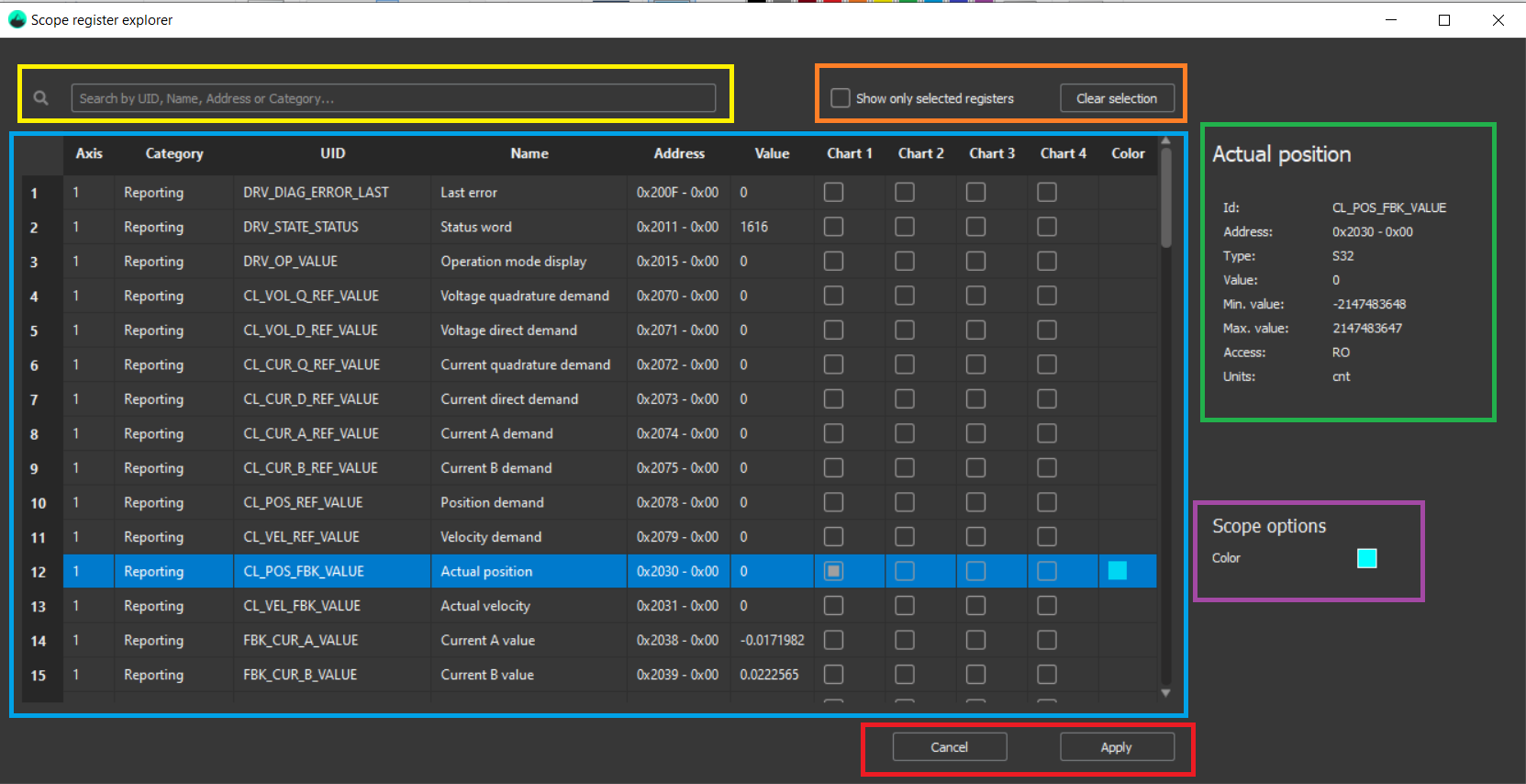
The Register Selector pop up has the following parts:
Registers table (blue rectangle above): Contains all the registers available for the Scope widget; available registers differ for each scope mode. Selecting a register from the table shows its detailed data on the right side (green and purple rectangles above).
The register data shown in the table:Axis: Axis related to the register. '-' if it’s a general register (not related to any axis).
Category: Subgroup under which the register is categorized.
UID: Register unique identifier, used by the Ingeniamotion python library.
Name: Human-readable name.
Address: Register address. An address for Ethernet and EoE; Index and subindex for CANopen and CoE.
Value: Last value read by MotionLab3. Warning: it may be an outdated value.
Chart (1 to 4): Checkbox to add the register to the Scope charts.
Color: When a register is selected for a chart, a color is assigned. It can be changed in the scope options section.
Search bar (yellow rectangle above): Filters any register field on the table.
‘Show only selected registers’ checkbox and ‘Clear selection’ button (orange rectangle above): Check box to show only the selected registers and a button to deselect all the registers.
Register data side panel (green rectangle above): All the selected register data.
Scope options (purple rectangle above): Register color can be changed by clicking on the color rectangle and selecting a new one.
Cancel and apply buttons (red rectangle above): Press apply to accept the changes, otherwise, press cancel.
Additional features during operation
Autoscaling
This button is located in the lower-left part of the Scope (green box below). It allows the Scope to autoscale the graph as new samples are plotted.
Moving options
Moving through the scope graph is quite intuitive. Use the mouse wheel to zoom in and out. Left-click and drag the graph to move around it. However, there is an option to lock the Y axis in case of wanting a specific X motion in the graph.
Advanced options of the Scope
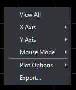
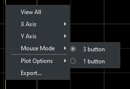
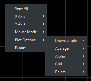
Right-clicking the scope graph will pop up the following menu.
View All
This mode will zoom out so the user can see the entire graph.
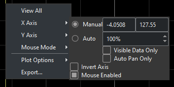
X Axis and Y Axis
These options will allow the user to specifically target each axis individually.
Mouse Mode
This will allow the user to switch between 3 and 1 buttons on a mouse, which will reduce or increase the functionalities of the mouse affecting the scope.
Plot options
These options affect the visible part of the graph:
Downsample → Affects plotted samples.
Average → Plots an average signal of the already plotted signals
Alpha → Changes opacity and visibility on the alpha channel of the signals.
Grid → Toggles the visibility of the X and Y axis grid lines.
Points → Switches on and off the points, if any, in the graph.
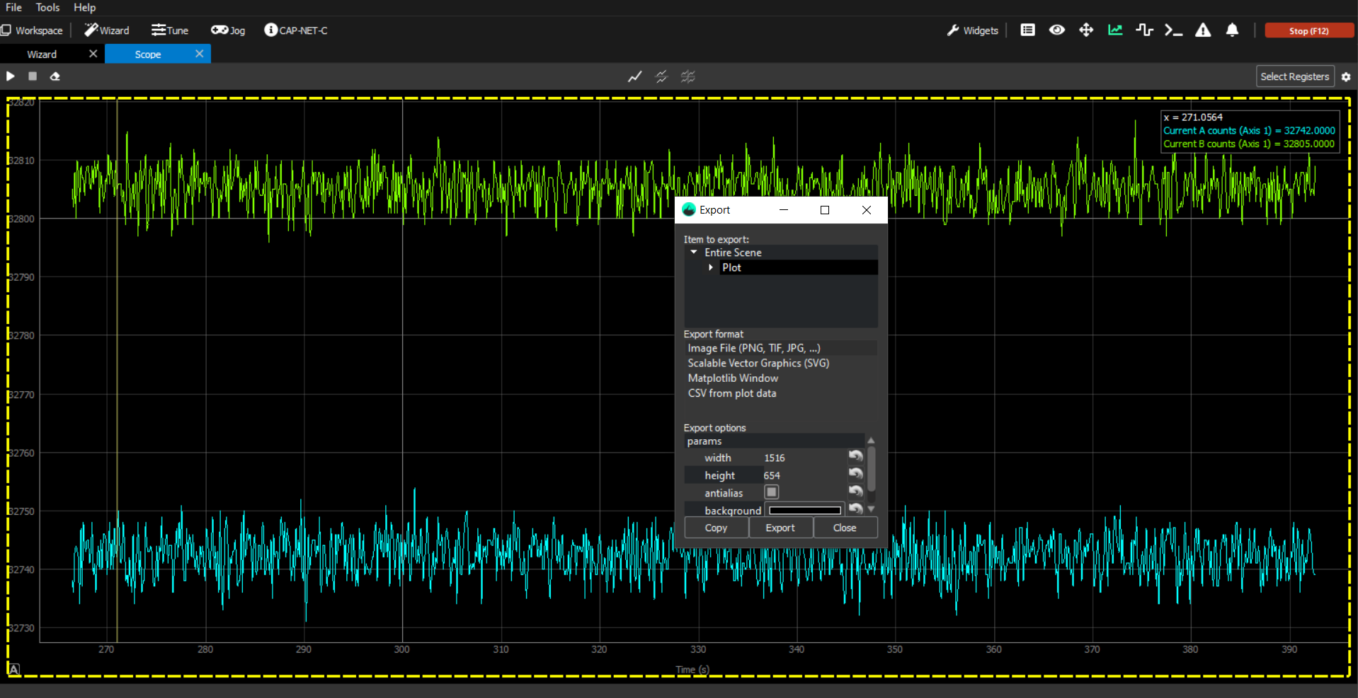
Export
It allows the user to export the graph data in different formats.
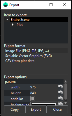
Item to export:
Entire Plot: The whole data range is selected.
Plot: Only the plot item is selected.
Viewbox: Only the viewbox is selected.
The segmented yellow line indicates the part of the scope to be exported.
Export format:
The user will be able to export at anytime the desired data in the following formats:
Image (PNG, TIF, JPG, ...) → Exports the selected area of the Scope as an image with the selected format.
Scalable Vector Graphics (SVG) → Exports the selected area of the Scope as a .svg file.
CSV → Exports the plot item of the Scope with all the plotting data as a .csv file (this option is limited to the plot item since its the one containing all the data).
How to use multiple charts at the same time
When using multiple charts at the same time, the user must be aware that the "Play", "Stop" and "Erase" buttons 
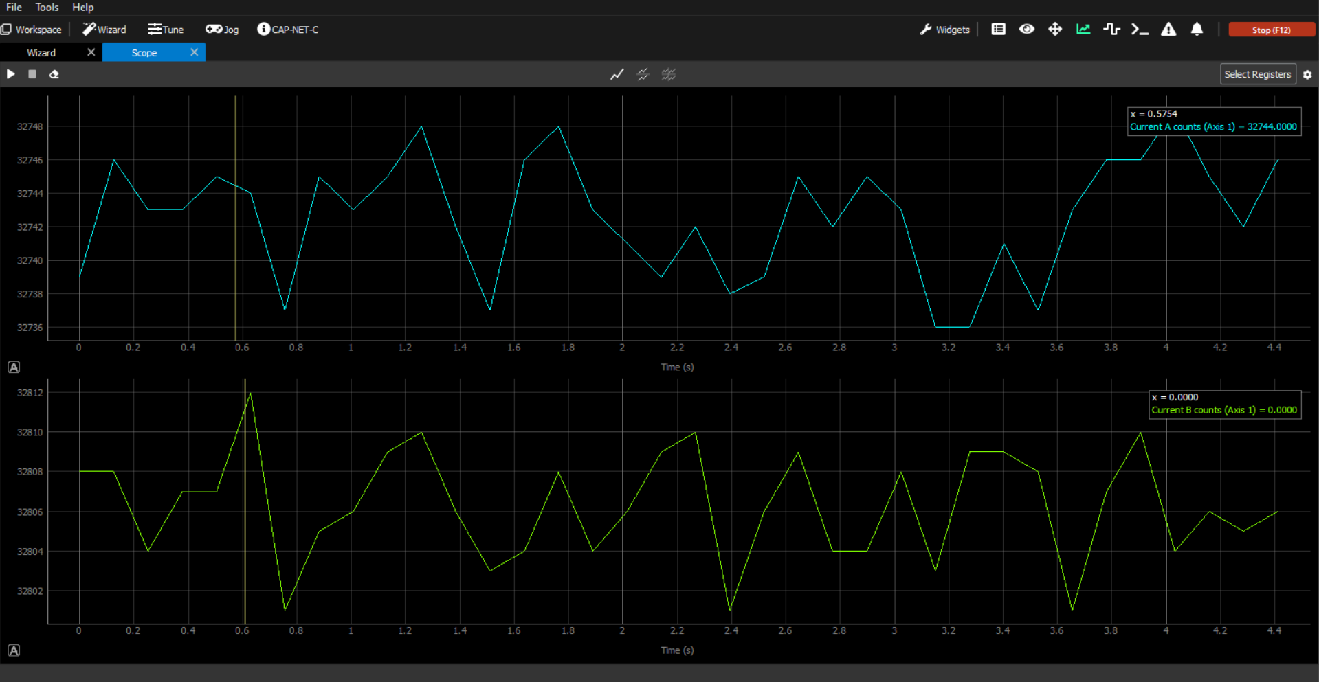
1 Chart
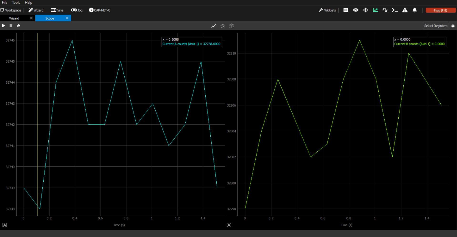
2 Charts
Horizontal split
Vertical split
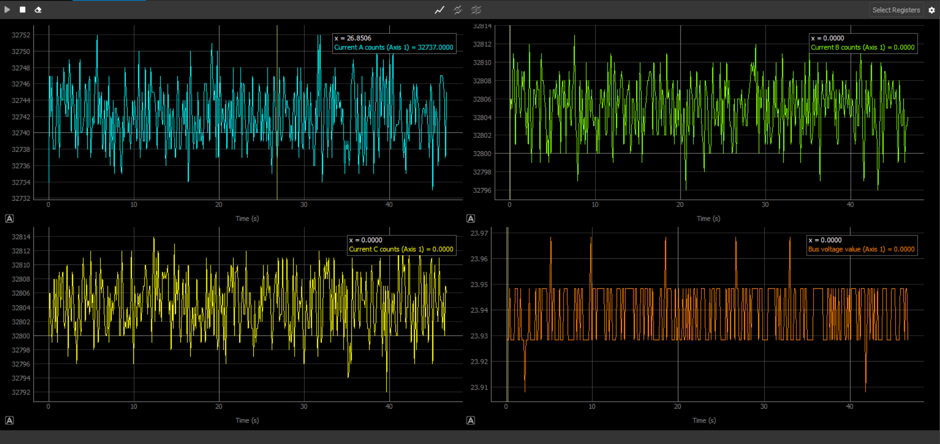
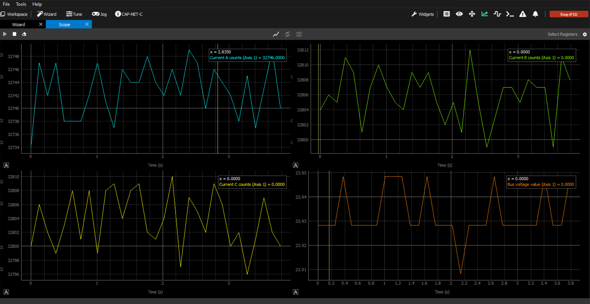
4 charts
2 Charts
Horizontal split
Vertical split
4 Charts
Legends in multiple charts
Static
The static legend will only give the data of the chart that is currently being covered by the mouse.
Floating and Floating Simple
For each chart that is displayed, an independent legend will be available. This way each chart has its own floating legend, that can be dragged around and moved conveniently.